


Brand creation & packaging design for parent company The Healthy Crop, and child company lil'POP.
I was asked to create a logo for both The Healthy Crop (parent company) and lil'POP (child company). Sydney Chasin, the founder of The Healthy Crop, was looking to create a brand for lil'POP that was fun and full of life, but that also had a rustic feel about it, prior to launching the first product to come from the lil'POP company; their first flavour of packed popped sorghum in pink himalayan salt flavour.
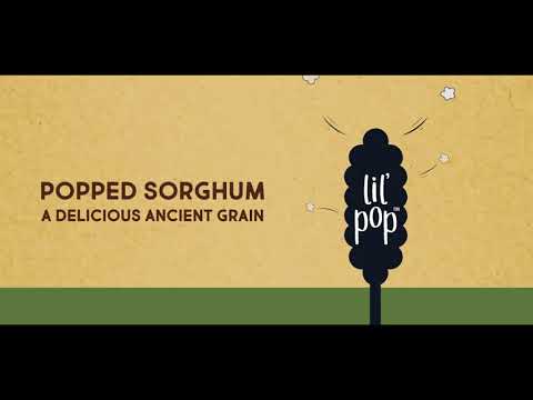
In order to do this, first primary and secondary fonts were chosen and designed, and a finalised logo was illustrated and produced. This was done over various rounds of feedback from Sydney as well as working alongside a copywriter. The final logo shows a full stalk of sorghum, the main ingredient of lil'POP, in a simplistic style illustration. It is shown as a shadow to ensure that the text of the logo would stand out. The 'lil'POP' font was a custom creation by myself, and was produced while bearing in mind the rustic and fun tone of voice that had been specified as a want for the brand.
The next stage was to create the packaging for the product. In order to produce the rustic feel that was established as a want for the brand, a textured brown paper was selected for the main body of the packaging. In order to effectively communicate what the product was, using the full lil'POP logo displaying the sorghum stalk was placed on the front and centre of the packaging, with the pops of sorghum channeling the fun, full-of-life tone of voice of the brand.
A bright, eye-catching pink for was selected to quickly communicate the flavour of the popped sorghum, effectively contrasting with the neutral colour of the packaging. Water drop illustrations were created to display the four main selling points of the product in a fun and non-obstructive way. This was also done to tie in with the fact that sorghum is an eco-friendly crop that uses far less water to grow than corn. Following the completion of the front of pack, the back of pack copy was placed and arranged, and thereafter, all marketing material was produced. This included A5 flyers, roller banners, exhibition stands and business cards. Motion graphic animations were also created for use on social media.
At the bottom of the page are some previous ideas from the design process for the lil’POP logo.